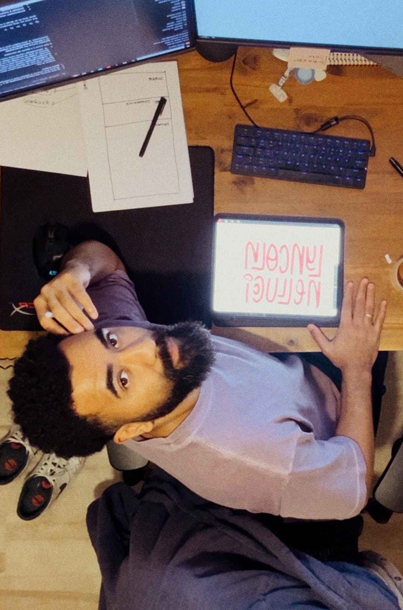
Lyncoln
Nellucci
Staff Product Designer at Itaú, working on the Design System of Latin America’s largest bank.
Product Designer
with 14 years of experience, specialized in Design Systems, Design Ops, and Product Design. My career combines strategy, technical leadership, and hands-on execution, with a strong focus on scalability and team enablement.
Currently at Itaú Unibanco,
leading the evolution of the design system and the integration of processes across teams. Previously worked at Banco Bmg and PagSeguro UOL, driving the creation and evolution of Design Systems, component libraries, and governance strategies.
Occasionally sharing experiences
whether by speaking at events, writing articles on Medium and LinkedIn, or mentoring designers.
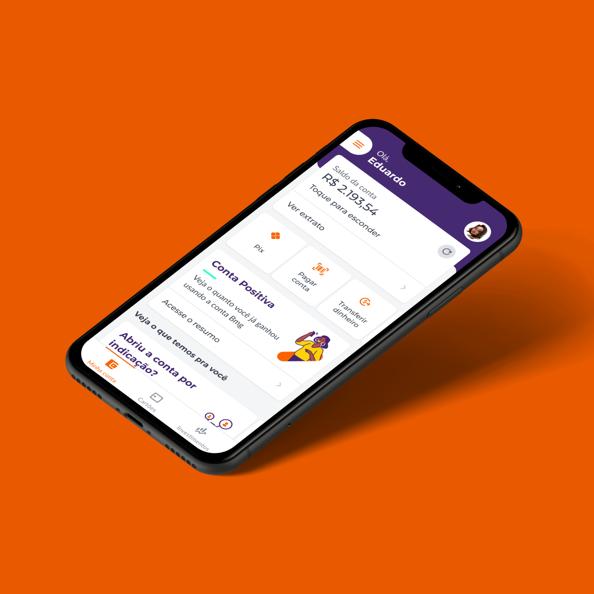
Banco Bmg (2019 - 2024)
Led the creation, evolution, and governance of Genesis Design System at Banco Bmg — a multi-theme, multi-platform system adopted by 11+ projects. Responsible for design tokens, component libraries (Flutter, React, native), governance processes, documentation, and metrics. Drove adoption through cross-disciplinary collaboration, training, and scalable workflows.


Defining Design System as Business as Usual for Product Designers and the benefits of it.
Full story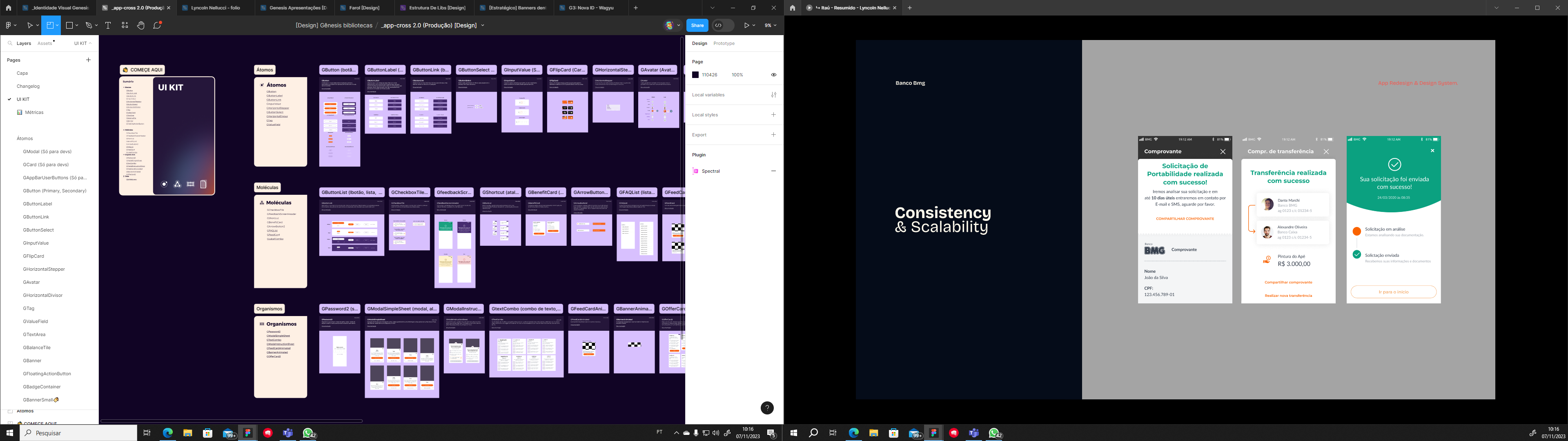
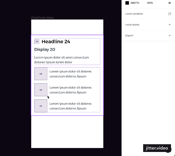
The components in Figma were organized into a UI Kit designed to provide a more intuitive and exploratory navigation experience. We implemented this approach after noticing that the design team’s natural behavior was to explore the library.
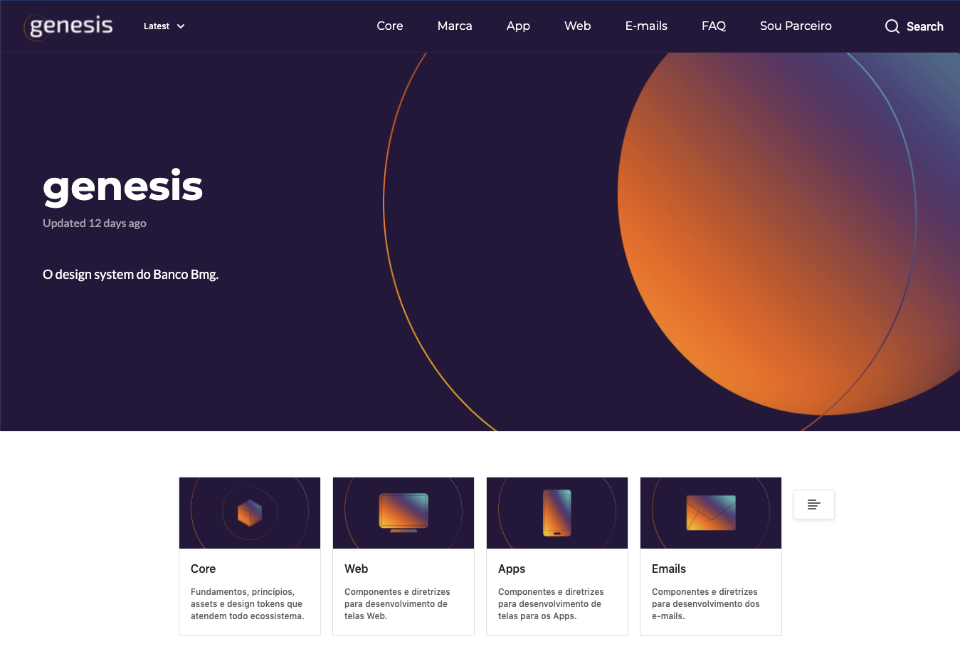
In Zeroheight, we built robust documentation that, beyond components, also included UX writing guidelines and a brand manual.
The Design System was born with the purpose of supporting the app redesign and later expanded to embrace other internal products.
Full storySharing experience
Often, simple day-to-day insights can spark meaningful reflections when shared. That’s why I like to document experiments, references, and practices that worked (or didn’t) in my work, creating opportunities for other designers to learn, adapt, and grow from these experiences.

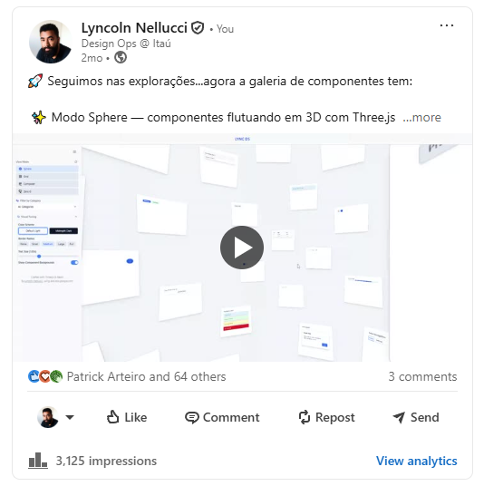
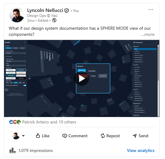
On LinkedIn, I share quick tips and experiments while staying connected and up to date with the design community.
Keyworkds Generator: Co-created a Figma plugin powered by GPT that generates AI-based keywords for components, reducing hours of manual work into seconds.
See it online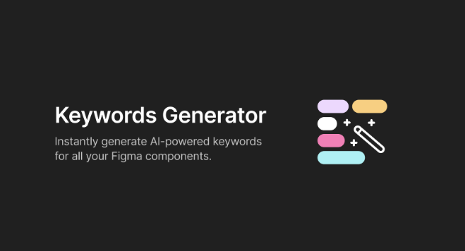
Keyworkds Generator: Co-created a Figma plugin powered by GPT that generates AI-based keywords for components, reducing hours of manual work into seconds.
See it online
Table of possible component properties. Use it as a reference to structure component creation and ensure consistency in property taxonomy
Figma CommunityProduct Designer
with 14 years of experience, specialized in Design Systems, Design Ops, and Product Design.
My career combines strategy, technical leadership, and hands-on execution, with a strong focus on scalability and team enablement.
Currently at Itaú Unibanco,
leading the evolution of the design system and the integration of processes across teams. Previously worked at Banco Bmg and PagSeguro UOL, driving the creation and evolution of Design Systems, component libraries, and governance strategies.
Occasionally sharing experiences
whether by speaking at events, writing articles on Medium and LinkedIn, or mentoring designers.
Banco Bmg (2019 - 2024)
Led the creation, evolution, and governance of Genesis Design System at Banco Bmg — a multi-theme, multi-platform system adopted by 11+ projects. Responsible for design tokens, component libraries (Flutter, React, native), governance processes, documentation, and metrics. Drove adoption through cross-disciplinary collaboration, training, and scalable workflows.


Defining Design System as Business as Usual for Product Designers and the benefits of it.
Full storyThe components in Figma were organized into a UI Kit designed to provide a more intuitive and exploratory navigation experience. We implemented this approach after noticing that the design team’s natural behavior was to explore the library.
In Zeroheight, we built robust documentation that, beyond components, also included UX writing guidelines and a brand manual.
The Design System was born with the purpose of supporting the app redesign and later expanded to embrace other internal products.
Full storySharing experience
Often, simple day-to-day insights can spark meaningful reflections when shared. That’s why I like to document experiments, references, and practices that worked (or didn’t) in my work, creating opportunities for other designers to learn, adapt, and grow from these experiences.
Design System Club is a growing community built to share knowledge, experiences, and best practices around Design Systems
NewsletterKeyworkds Generator: Co-created a Figma plugin powered by GPT that generates AI-based keywords for components, reducing hours of manual work into seconds.
Figma CommunityOn LinkedIn, I share quick tips and experiments while staying connected and up to date with the design community.


Table of possible component properties. Use it as a reference to structure component creation and ensure consistency in property taxonomy
Figma CommunityLyncoln
Nellucci
Staff Product Designer at Itaú, working on the Design System of Latin America’s largest bank.
Product Designer
with 14 years of experience, specialized in Design Systems, Design Ops, and Product Design. My career combines strategy, technical leadership, and hands-on execution, with a strong focus on scalability and team enablement.
Currently at Itaú Unibanco,
leading the evolution of the design system and the integration of processes across teams. Previously worked at Banco Bmg and PagSeguro UOL, driving the creation and evolution of Design Systems, component libraries, and governance strategies.
Occasionally sharing experiences
whether by speaking at events, writing articles on Medium and LinkedIn, or mentoring designers.
Banco Bmg (2019 - 2024)
Led the creation, evolution, and governance of Genesis Design System at Banco Bmg — a multi-theme, multi-platform system adopted by 11+ projects. Responsible for design tokens, component libraries (Flutter, React, native), governance processes, documentation, and metrics. Drove adoption through cross-disciplinary collaboration, training, and scalable workflows.


Defining Design System as Business as Usual for Product Designers and the benefits of it.
Full storyThe components in Figma were organized into a UI Kit designed to provide a more intuitive and exploratory navigation experience. We implemented this approach after noticing that the design team’s natural behavior was to explore the library.
In Zeroheight, we built robust documentation that, beyond components, also included UX writing guidelines and a brand manual.
The Design System was born with the purpose of supporting the app redesign and later expanded to embrace other internal products.
Full storySharing experience
Often, simple day-to-day insights can spark meaningful reflections when shared. That’s why I like to document experiments, references, and practices that worked (or didn’t) in my work, creating opportunities for other designers to learn, adapt, and grow from these experiences.
Keyworkds Generator: Co-created a Figma plugin powered by GPT that generates AI-based keywords for components, reducing hours of manual work into seconds.
See it onlineKeyworkds Generator: Co-created a Figma plugin powered by GPT that generates AI-based keywords for components, reducing hours of manual work into seconds.
See it onlineOn LinkedIn, I share quick tips and experiments while staying connected and up to date with the design community.

Table of possible component properties. Use it as a reference to structure component creation and ensure consistency in property taxonomy
Figma CommunityProduct Designer
with 14 years of experience, specialized in Design Systems, Design Ops, and Product Design.
My career combines strategy, technical leadership, and hands-on execution, with a strong focus on scalability and team enablement.
Currently at Itaú Unibanco,
leading the evolution of the design system and the integration of processes across teams. Previously worked at Banco Bmg and PagSeguro UOL, driving the creation and evolution of Design Systems, component libraries, and governance strategies.
Occasionally sharing experiences
whether by speaking at events, writing articles on Medium and LinkedIn, or mentoring designers.
Banco Bmg (2019 - 2024)
Led the creation, evolution, and governance of Genesis Design System at Banco Bmg — a multi-theme, multi-platform system adopted by 11+ projects. Responsible for design tokens, component libraries (Flutter, React, native), governance processes, documentation, and metrics. Drove adoption through cross-disciplinary collaboration, training, and scalable workflows.


Defining Design System as Business as Usual for Product Designers and the benefits of it.
Full storyThe components in Figma were organized into a UI Kit designed to provide a more intuitive and exploratory navigation experience. We implemented this approach after noticing that the design team’s natural behavior was to explore the library.
In Zeroheight, we built robust documentation that, beyond components, also included UX writing guidelines and a brand manual.
The Design System was born with the purpose of supporting the app redesign and later expanded to embrace other internal products.
Full storySharing experience
Often, simple day-to-day insights can spark meaningful reflections when shared. That’s why I like to document experiments, references, and practices that worked (or didn’t) in my work, creating opportunities for other designers to learn, adapt, and grow from these experiences.
Design System Club is a growing community built to share knowledge, experiences, and best practices around Design Systems
NewsletterKeyworkds Generator: Co-created a Figma plugin powered by GPT that generates AI-based keywords for components, reducing hours of manual work into seconds.
Figma CommunityOn LinkedIn, I share quick tips and experiments while staying connected and up to date with the design community.

Table of possible component properties. Use it as a reference to structure component creation and ensure consistency in property taxonomy
Figma Community